New Artwork

HUGE Update! by Shingo Shimizu

Long overdue, I’ve finally came around to updating my portfolio. The recent update includes UI design, new Eastbound Brewing Co. beer illustrations, and a tonne of icons. I’ll probably have to minimize my shown works at some point soon (it’s getting quite bloated). Until then, enjoy the images, and tell all your friends! Thank you. :)

Scion Magazine - Issue 4 (the Music Issue) by Shingo Shimizu

Apologies, for not posting for a while everyone! It's been quite busy since this project ended (which is SO great), but it means I have no time to write a proper post. 

Scion Magazine Issue 4 starts off a new format: 48 page magazine at 10.25" x 14.5" but still printed on the matte recycled stock. It's also the first of 'themed' issues, starting with 'the Music Issue'. Yes it was very exciting: bigger, more pages, and lots of music content! I thought I'd actually get quite tired of drawing speakers, records, or headphones...but surprisingly I didn't! It makes for great practice too~. 

Anyhow, more stuff being posted this week! Seriously. :)

CHECK IT OUT HERE!

DOS: In the Works by Shingo Shimizu

Just getting ready for an upcoming group art show DOS this Friday July 19 @ Evergreen Brick Works. Tacos will be provided by La Carnita and Big Star (Chicago), with music by Dj Platurn and Grandtheft. Pretty excited as my friends: Jacqui Oakley, Jamie Lawson and Carson Ting will be in it as well! Don't forget to buy tickets in advance and arrive early! Hope to see you all there.

12fe004ce2bd11e28ddc22000aeb1014_7.jpg
c0bf9d50e54511e2868f22000a1f97ea_7.jpg
08082e9ae77911e280ba22000a9f1893_7.jpg
f330c9d8ed3f11e2a8fa22000ae9142a_7.jpg

La Carnita 2013 Skull Print by Shingo Shimizu

So, I'm currently working on some new skull work for the upcoming DOS show. In the mean time, check out the skull I did for La Carnita restaurant below. :D

----------------------------

La Carnita restaurant approached me to create a new limited edition (I think it was 1000) skull art print for them. If you don't know, La Carnita is pretty well known in Toronto for it's take on Mexican street food (mostly tacos), with a modern flair. The interior is a fun mix of graffitti, and layers of printed skulls on the walls. 

Being my third time to create a skull for them, I couldn't help but think I was out of ideas, as I had done at least 6 skulls (La Carnita included). 

At the time I was really drawn to simple patterns and shapes. Also for some reason, I kept thinking that I had to brand it somehow, and include some sort of reference to carnita tacos.

Anyhow take a look at it from start to finish!

rough-1.jpg

Yes very luminato mixed with that cute little piggy from 'Babe'.

rough-2.jpg

...or one of the pyramids could be from space? hmm.

skull-2b-01.jpg

Blocking out shapes.

skull-5-04.png
skull-4-02 2.png

Adding way too many things...

skull-final-blacklores-01.png

At this point, realizing a little too much is going on.

FINAL VERSION: 5x7" 1000 prints. Stripped the elements down for the final, realizing that less is more. Voila!

3977145c8db811e292fc22000a1f9806_7 1.jpg

New Beastie Boys Illustration for Grantland by Shingo Shimizu

This was for an upcoming Grantland book (no 5? or is it 6?) for an article, 'In Memoriam: Adam Yauch (1964-2012)'. My way of honoring him, HAD TO BE with all of the Beastie Boys together of course. As a unit, at the peak of their careers, just after the release of 1998's 'Hello Nasty'. The first single off of the album was 'Intergalactic', and for me I had heard it by watching the video on MuchMusic. It just blew me away, having rap music over their ode to old school Japanese TV superheroes (also known as 'tokusatsu'). I watched the real TV shows ever since I was a little boy. So in coming up with ideas for this article, it was almost instant that I thought of that video, because it made the biggest impression on me visually as a band (with 'Sabotage' in close second). If you haven't seen the video, check it here (seriously you haven't seen it?). 

'Oh and what color did you go with?' you might ask. Bright Pantone Yellow of course. Duh. Maybe I should offer this as a print? :)


Cruder the better! In the beginning anyways.

A new formation, posing with their fighting robot

Getting the pose right. Just need to get the faces right...

Final version with color!


Don't forget to follow me here and here! :D

Sneak Peek: Scion Issue 4 'Music Issue' by Shingo Shimizu

Over the last few months I remember my response to the usually welcoming line, 'Shingo I have a great project for you!' was turned down with,'I can't, I'm sorry I'm very busy.’ That wonderful project I've been working on for the last three months was the fourth issue of Scion magazine with Editor-in-Chief, Lisa Marie Chen. I was responsible for the overall art direction, with duties on illustration and design as well.

It has now been printed, and will be distributed out to stores very soon across Canada. Pretty exciting!

You will notice (photos coming soon), that the format has changed. Previous issues measured at a tiny 5.5" x 7.125". Scion magazine is now a whopping 10.5 x 14.5" on the same bright white recycled stock, and 48 pages. 

For every issue, we try to give a little ‘something something’ for the reader. So to commemorate this music focused issue, there is a pullout Scion branded 'gig poster'.

Stylistically there is more range. I went looser with the design template, at the same time showcasing a broader range of style (minimal, hand drawn, hand written, hand made, etc.), which is what I was hoping to achieve. It gives the magazine a ‘warmer’ feel than the previous issues. Kind of like the feeling when you flip through a pile of eye catchy record covers. It also features some great photography by Andy Lee, as well as some great collage illustrations by Rachel Kennedy.

So without further ado, it is with great pleasure, I give you a glimpse of Scion magazine Issue 4, the 'Music Issue'.

Cover-front-500px.jpg
record-poster-600px.jpg

Happy 2013, for real! by Shingo Shimizu

Embarrisingly, I started my first post of the year by wishing everyone a 'Happy 2013!', in the subject header, and nothing in the post. Note to self, to not post anything on my iphone before going to bed. So here's the actual post…

Happy 2013 everyone! Wishing you, your business, family and friends happiness and health in 2013! To the thousands that checked out my site regularly in 2012, I want to thank you for all your support. I hope that you will continue to come back and see what I've been up to. If you're an art director, designer, photographer or illustrator, I look forward to possibly working with you in the near future! On a different note, when you work alone, it's extremely difficult to get around to updating the portfolio site. Which is why I'm just doing this now. I've just started to add a few projects from summer and fall of last year: 4 illustrations for the 100th GreyCup CFL Championship (commissioned by Bensimon Byrne), and photographs of Scion Canada magazine issue #3. Check it out below.

DON'T FORGET > that my Def Jam print is finally up on my InPrnt page for sale. Check it here >

ps: Would appreciate it so much, if you could spread the love by 'liking' my posts and or tweeting. :)

More work will be uploaded this week. See you back soon!


VIEW MORE CFL ARTWORK >


VIEW MORE SCION MAGAZINE ARTWORK >


James Bond 007: Illustration for The Genteel 5 by Shingo Shimizu

New illustration for The Genteel i just finished, published today! 

An Accessory for the Modern Man

by: Andrew Adebowale

The James Bond franchise is celebrating its 50th year with the release of Skyfall at the end of the year. To mark the occasion, a unique exhibition is being held at London's Barbican, showcasing the design and style of the world's most famous spy.

Read Article >

007sketches.jpg

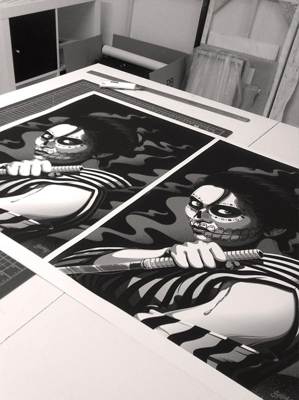
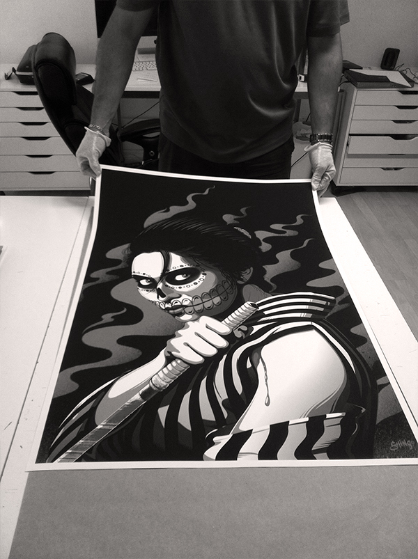
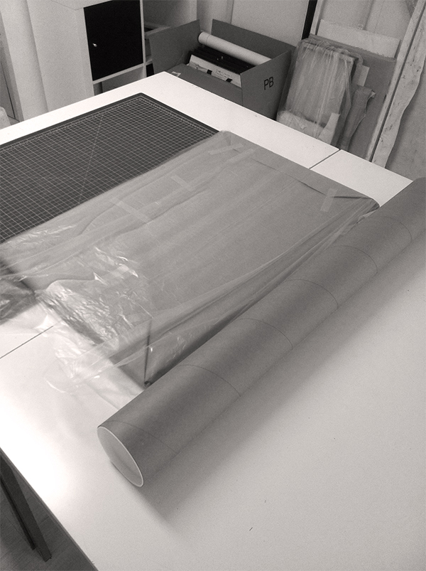
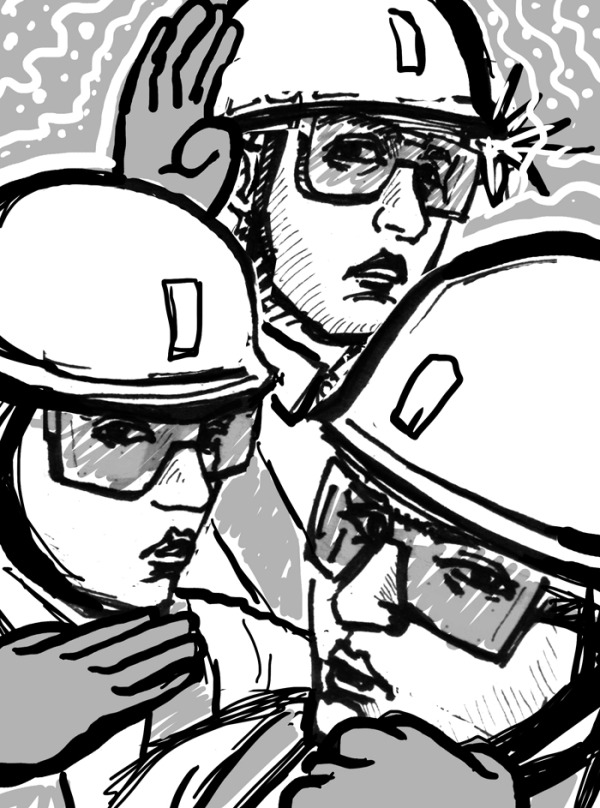
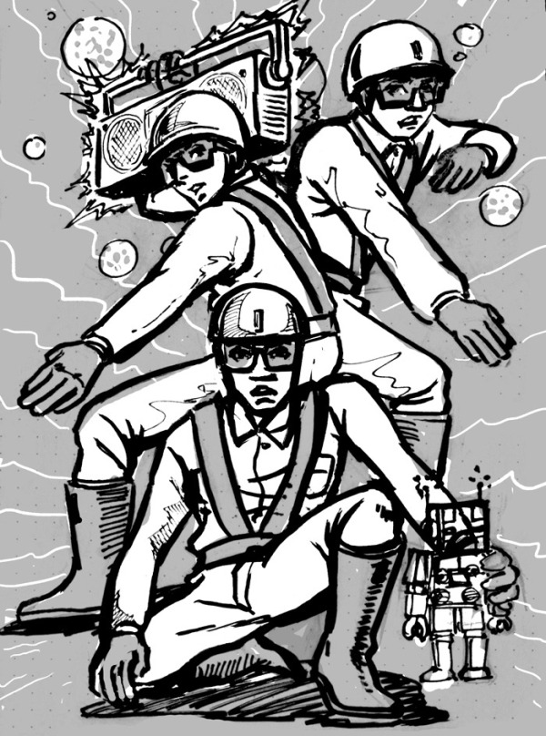
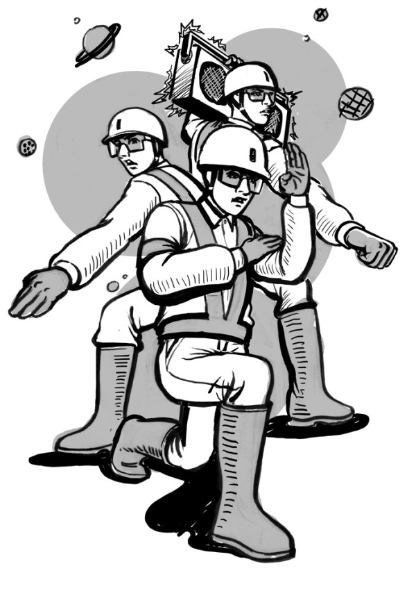
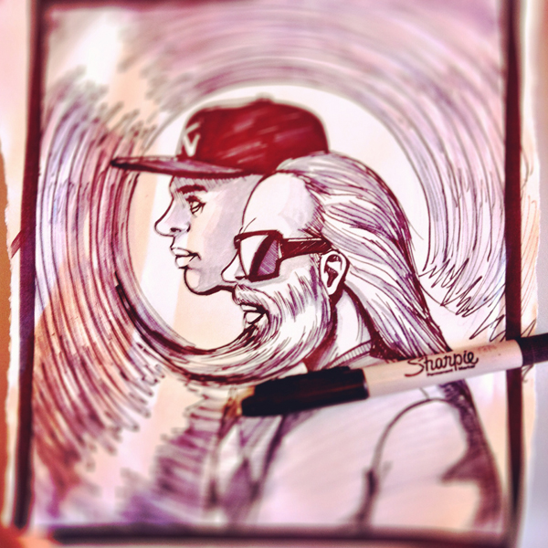
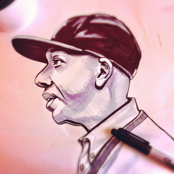
Really rough sketches...

Ok, this was definitely the most fun assignment EVER. If you really know me, you would know that I'm one of the world's biggest James Bond fans.

My first film was apparently 'From Russia With Love', which my dad made me watch on TV. I'll admit I wasn't a huge fan of Connery in the beginning. Dad was trying to explain to me why Connery was 'the man'. But like most kids, I quickly became a Roger Moore fan because of his humor, his ladies (he had more conquests), and gadgets with 'wow' factor (Lotus Esprit submarine). It wasn't until early high school, I rewatched 'Dr. No', and from that very first introduction of 007 lighting his cigarette at the casino table introducing himself, I became a fan. I thought, 'there is no one cooler than Connery's Bond'. 

I actually had to ask my dad, what my first 007 film was (I've rewatched them way too many times). It was was then, when he said something that shocked me."I hope it doesn't take you as long as it did for me to graduate from 007.” I thought my dad, the one who introduced me to it, how could he have 'graduated' (move on) from it? And why was he telling me to move on from it?

As a kid, I was obsessively into three things: James Bond, Petshop Boys, and New Order (in that order). At my age now (over 30), I'm still into those 3 things. Maybe not as obsessive, as I was back then. Also I still prefer 'those things' from that era or before. 

I am however, really looking forward to the next 007 movie Skyfall (directed by Sam Mendes). It just screams old school elements (Aston Martin DB5 again), combined with new school tech backdrops. The set design and cinematography look immaculate. Also filled with such a talented cast (Bardem, Fiennes, Dench, Finney), and directed by an A-list director: Sam Mendes. Trailer looks so great!

So as long as more James Bond movies get produced until the day I die, I don't think I'll ever stop watching them. I know I'm letting you down Dad, but I don't think I'll ever graduate from 007!

New Russell Simmons & Rick Rubin Illustration for Grantland by Shingo Shimizu

My sketches always start really crude. I usually don't bother with reference photos for portraits in the beginning.

A more polished rough. 

Finished this back in March (or April?), but was finally allowed to post this up. New illustration of Russell Simmons and Rick Rubin for Grantland. Lots of textures here with brushstrokes. Limited colour schemes are always fun. :)

Illustration for the Genteel 4 by Shingo Shimizu

New illustration for The Genteel i just finished, published today! 

Haute or Not?

by: Chere Di Boscio 

Despite their astronomical price tags, haute couture creations are rarely profitable, and only a handful of women can afford to buy them anyway. So what's the point?

Read Article >

This assignment was definitely the most fun for sure. Being able to check out the Alexander McQueen show at the MET last year was such a huge inspiration for me creatively. I mean I've seen a lot of 'fashion' on TV and in books through high school and at OCAD (was hardcore into Issey Miyake of course). But to see them in person...at the MET...after a 2.5 hour line up...really blew me away. Since then, my appreciation for craftsmanship has grown immensely. Currently I'm really digging the work of Katsuya Kamo. Check out his paper sculptures (hats and stuff) coupled with Lagerfeld's designs for Chanel's 2009 Couture show here.

Illustration for The Genteel 3 by Shingo Shimizu

Another new illustration for The Genteel! Do you recognize any of the faces on the left hand side? Hopefully you do if you're in the fashion world.

Love doing this style. I suppose most of it comes rather easily as I work a lot in vector. Over the years I've become more and more obsessed with detail (I suppose it's natural since I spoil myself by zooming in 1200% a lot of the time). 

Digital Newsstands With Virtual Shopping Racks

by: Paul Aguirre Livingston 

As the digital world continues to become the new developed world, I find myself doing more with virtual assistance: maintaing some sort of "social life," consuming and creating content, and, well, general sundry tasks like, say, shopping.

Read Article >

Illustration for The Genteel 2 by Shingo Shimizu

Also just finished this one with a new look and feel (for me) for the wonderful folks at The Genteel! This time around I got to get a little drawing time with Twiggy's face. (I need to definitely draw more of her.)

The article is not about her, but more about 'mature' models in the fashion world, and why '...ageing and fashion have - until now - been such odd bedfellows in the first place.'

A New Age in Fashion

by: Erin Ridley 

With the public smitten by more mature looks and the industry following suit, one wonders why ageing and fashion have - until now - been such odd bedfellows in the first place.

Read Article >

Illustration for The Genteel 1 by Shingo Shimizu

Just finished a new illustration with a new look and feel (for me) for the wonderful folks at The Genteel! It's fun to get back to drawing more fashionable subjects.

If you haven't checked their site yet, definitely do if you love a good read. Oh and there will be more work by yours truly there of course. :)

The Importance of Being Fashionable

by: Erin Ridley 

Women think about fashion 91 times a day. For those who have "clothes on the brain," why is fashion so important to us. 

Read Article >

Sneak Peek: New Works by Shingo Shimizu

My favourite time of the work year, is when I reach that sweet spot of interesting work coupled with great weather. Just finished a small batch of works for La Carnita and Exclaim magazine (an illustration of 'the Gossip"). They're both not out yet, so you can grab a small preview of them below. Deadlines are getting tighter these days, where I actually forget to sign my work. (ugh) 

Check back soon for the final versions!

taco2-ss.jpg
taco-ss.jpg
thegossip-ss.jpg

Lots of New Works! by Shingo Shimizu

More new works updated in my portfolio:

1) Completed paper doll illustrations for Antipasto magazine.

Vector illustrations of a women with mix and match fashion items.


2) Illustrations for Scion magazine issue 3

Vector illustration for Scion gear ad, badge designs (or icon illustrations) for "the Good, the Bad, & the Frosty" sports article, pencil crayon animal heads for "Winter Wild" fashion spread, and infographics for "Tap the Sap" article on maple syrup.

a few more to come soon!


Click here to see more in 'New Works'!


@La_carnita #UNO #Artshow Submission Complete by Shingo Shimizu

So I just finished signing my 18" x 24" giclee prints (will be sold at the UNO show on friday) and dropped them off at @La_Carnita!!!

YES, you heard right. New prints will finally be available, printed with the highest quality using Epson Stylus Pro 9900 (scroll down below for more info on Epson Technology) on Epson Matte paper.

Relaxing now eating a grilled chicken bahn mi sandwich from Bahn Mi Boys, and an americano from Sense Appeal. It is a good day today. 


ps: thanks to Richardson DX for the photos!


Could that be the new issue of Scion Magazine Issue 3???


Epson Technology

To produce our archival prints with amazing colour integrity, gloss-level, and scratch resistance we use Epson Stylus Pro 9900.

Representing Epson's next generation, the Epson Stylus Pro 9900

(44 inch) incorporate the latest achievements in photographic ink jet technology. By combining the precision of the MicroPiezo TFP™ print head with the extraordinary performance of Epson Ultrachrome® HDR Ink, the newest generation of Epson Stylus Pro printers continue to represent a level of technology unprecedented in Epson's history. 

Epson Ultrachrome High Dynamic Range (HDR) represents the latest generation of pigment ink technology. Now utilizing 10 COLOURS (including an all new ORANGE and GREEN) Epson Ultrachrome HDR Ink produces the widest colour gamut ever from an Epson Stylus Pro printer. Even more remarkable, when combine with the new Epson AccuPhoto™ HDR screening technology, Epson has once raise the level of print quality, while setting a new benchmark standard for photographic reproduction.


Epson Accuphoto™ HDR Screening

*- Advanced ten-colour screening algorithm resulting in prints with superior colour and clarity.

*- Maximum resolution of 2880 x 1440 dpi for incredibly sharp text and line art.

*- Produces extremely fine blends and photographic transitions.

*- Extremely accurate highlight-to-shadow details.

*- No visible photographic graininess due to the printing process.

*- Ensures consistent color balance regardless of the viewing light source.

*- When combined with the precise dot placement accuracy of the Epson MicroPiezo TFP print head, overall photographic print quality is dramatically improved.


EPSON ENHANCED MATTE:
Archival quality 76 years approximately
Flat matte surface provides the optimum photographic platform.
Heavyweight stock delivers true photographic feel.
High colour gamut yields remarkable colour reproduction.
Epson Archival Ink compatibility ensures exceptional lightfastness ratings.